ONTARIO
PARKS
RESERVATIONS
Improving the Booking Experience for Park Guests
As part of an intensive course at Humber College, I re-designed a campsite booking system which serves 55, 000 people a year.

Client
Ontario Parks
Role
UX Designer
Team
2x UX Designers
Timeline
January 2023 -
May 2023
Contribution
User Research,
Usability Testing,
Prototyping
Tools
Figma
Balsamiq
Miro
Google Docs
Problem Statement
Ontario Parks campers are unable to efficiently book a campsite that meets their criteria due to a fractured user journey and features being dispersed across the site.
During the COVID-19 pandemic, Ontario Parks saw a 50% increase in customers attempting to book a campsite.
The influx of users overloaded the Ontario Parks Reservations’ booking system and underscored already existing issues including:
+ system crashes due to heavy traffic
+ users struggling to find available campsites
+ customers fearing that all campsites will be booked unless they've conducted extensive research about camping at Ontario Parks
+ an outdated interface and visual components
Product Background
In 2010, the tech company Camis won the bid to be Ontario Parks Reservations’ software provider. The limited options to customize their off-the-shelf reservation and facilities management product have led to usability problems and user frustration since it is not tailored to the needs of Ontario Parks customers.
PROCESS

EMPATHIZE
Desk Research
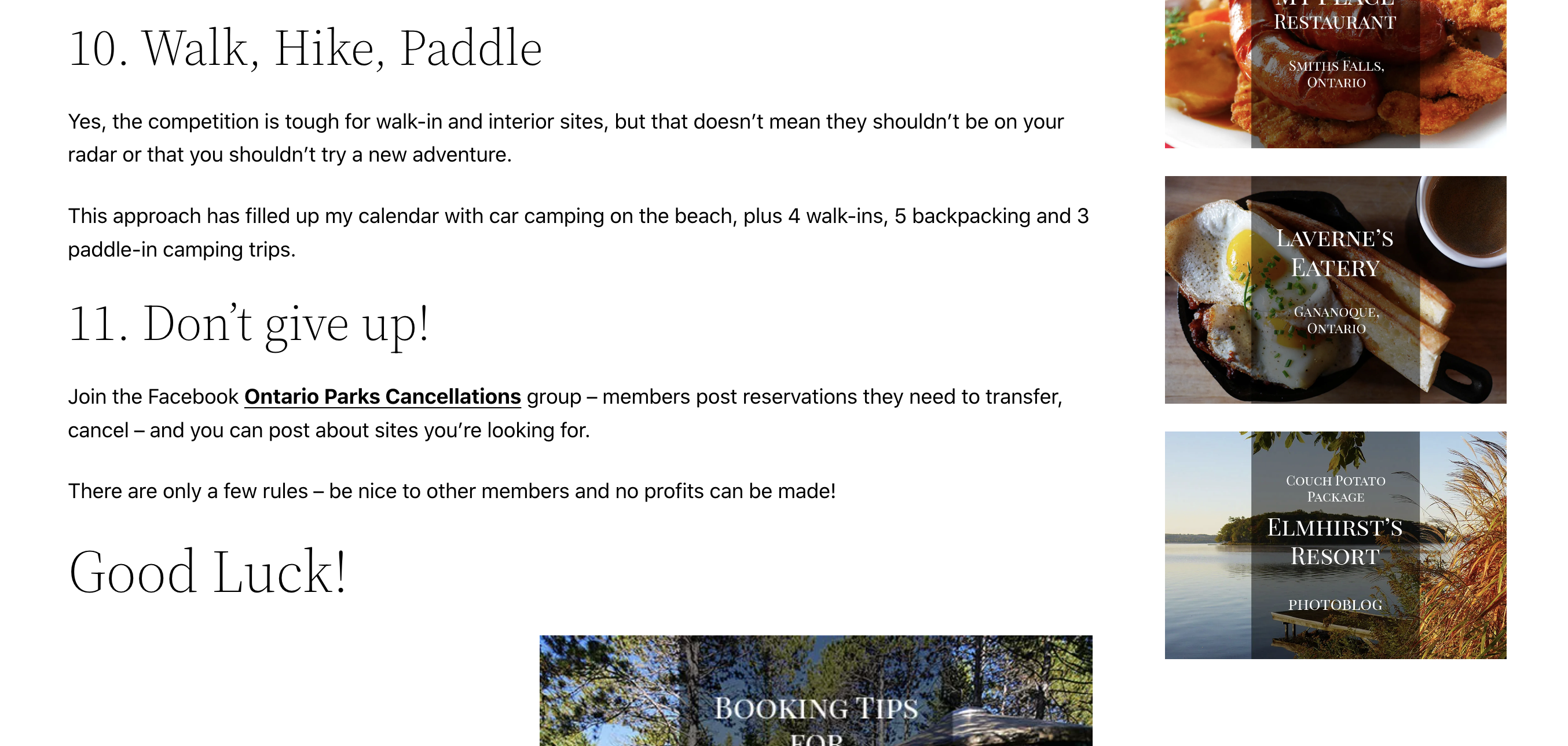
A sub-culture of independent bloggers and websites with step-by-step guides explaining how to navigate the booking system and find park information emphasized the lack of features and instructions for users on the current Ontario Parks system and hinted at which usability issues our team should explore for the re-design.


Project Goals
1. Create a booking journey that feels effortless
2. Grow Ontario Parks' revenue by improving the booking system, feature functionality and content
3. Increase visitor frequency by providing park information and details to online customers
4. Use the website to attract visitors from across the province
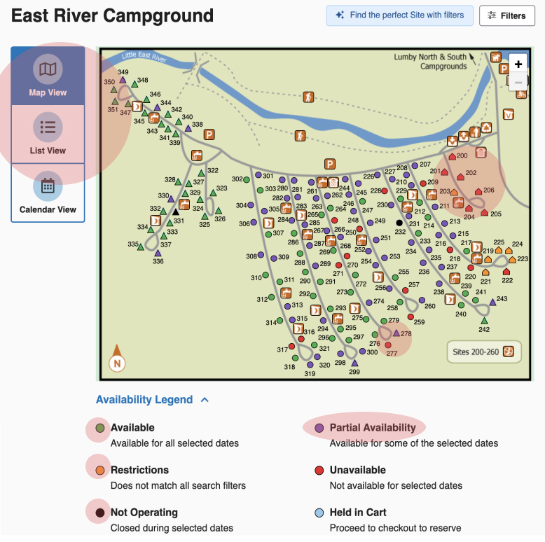
Heuristic Analysis
- Unintuitive information architecture
ex. related information scattered across the website
- Poor user feedback
ex. filters only after inserting reservation details, campsite availability given the end of user journey
- Terminology and language does not accurately describe content
- Unclear instructions and help text
ex. hidden features, unlabelled icons, no directions
- No recovery from error
ex. no back buttons
Card Sorting
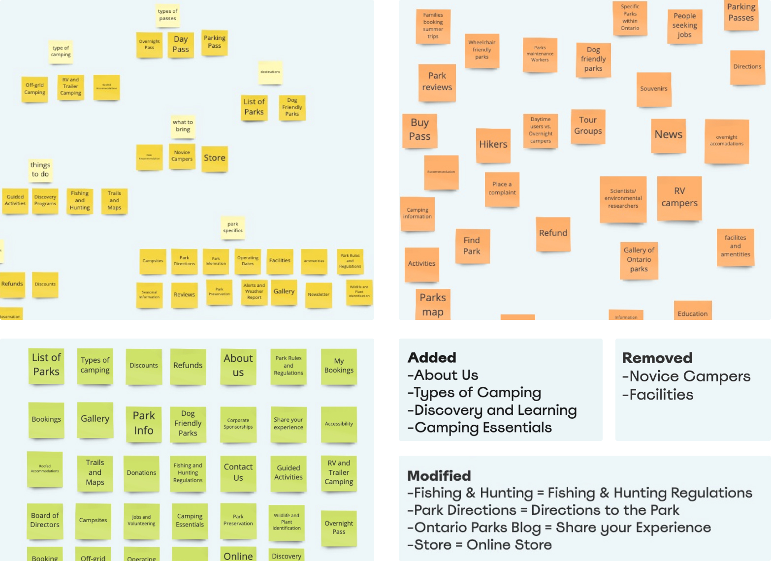
Vague terminology and unclear information architecture was tested by conducting 6 card sorting exercises.
Participants were asked to group cards representing the global navigational options to their liking during the open card sorting session. They could arrange cards however they liked and make recommendations if they felt a misrepresentation or gap.
4 new terms were added, 2 removed, 4 modified.
Usability Testing (First Round)
One-on-one usability testing uncovered painpoints in the user journey, content and user interface since the website's navigation was being re-constructed.
User profiles who we would invite to participate in the study:
+ The Family Camper
+ The Tourist
+ The Expert Camper
What did we learn?
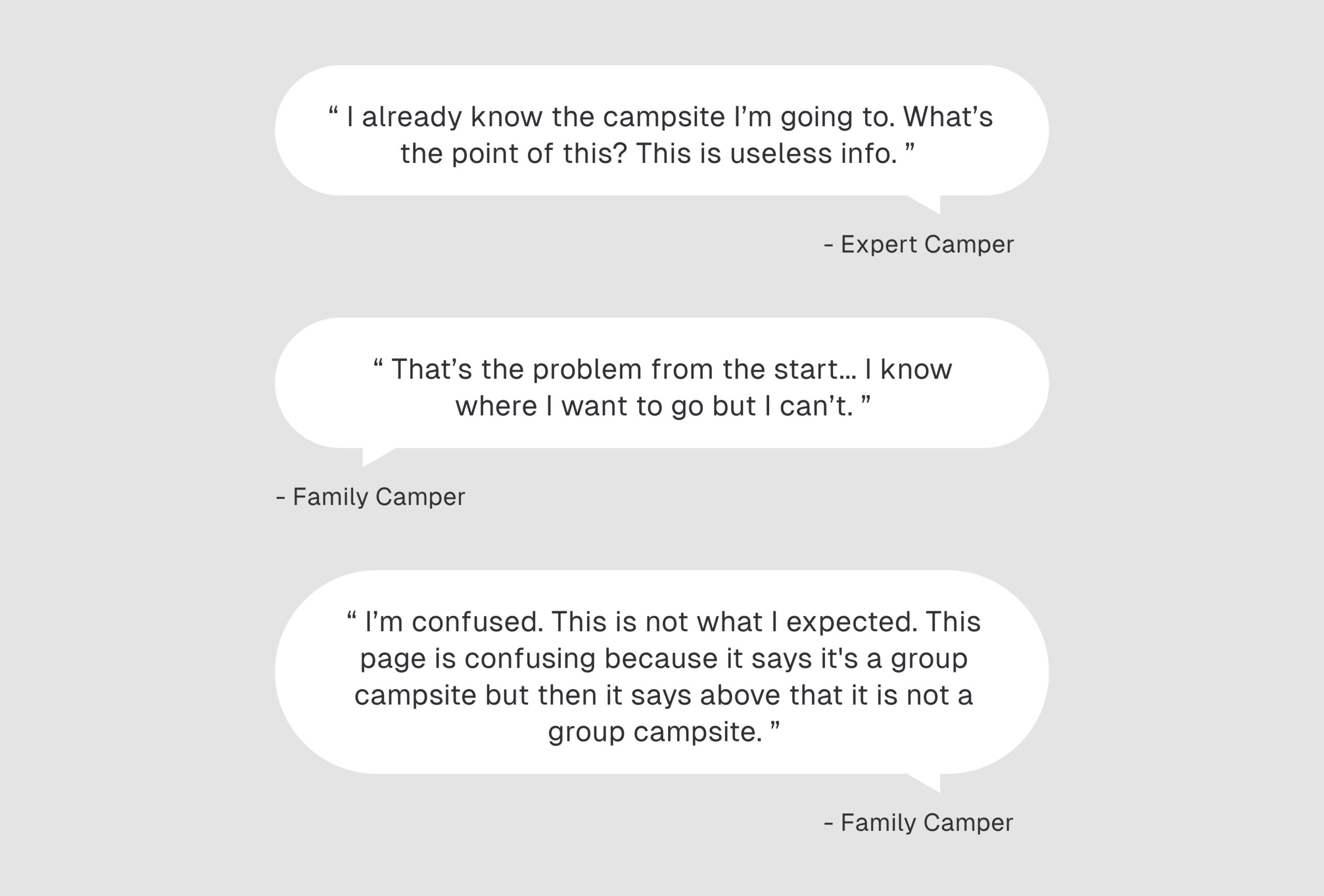
Participants were confused by the functionality of the website. Each participant got lost during the booking process and ran into usability issues. Only half of test participants were able to successfully book a campsite which meet their trip requirements.
Following the sessions, using the heuristic principles, we categorized the usability issues by level of severity and each problem’s resolution complexity in order to prioritize the website’s challenges. This was followed by our team recommendations for addressing the issues.
DEFINE
DEFINING THE PROBLEM
How did we ultimately define the problem from a UX perspective?
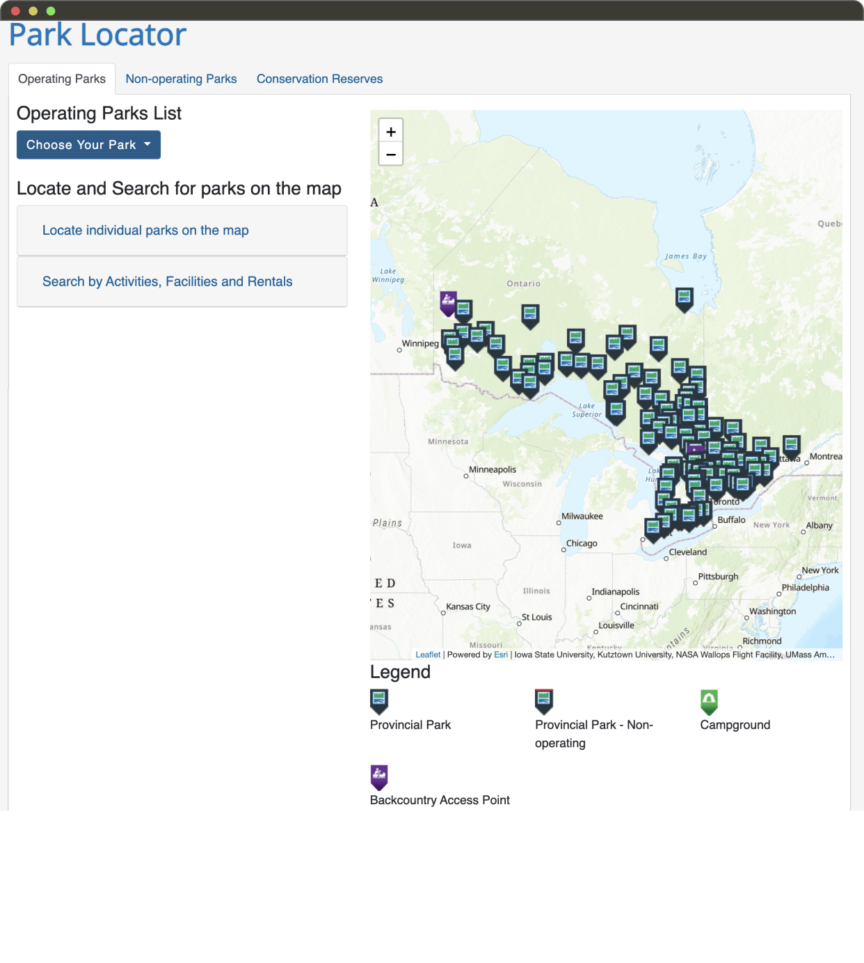
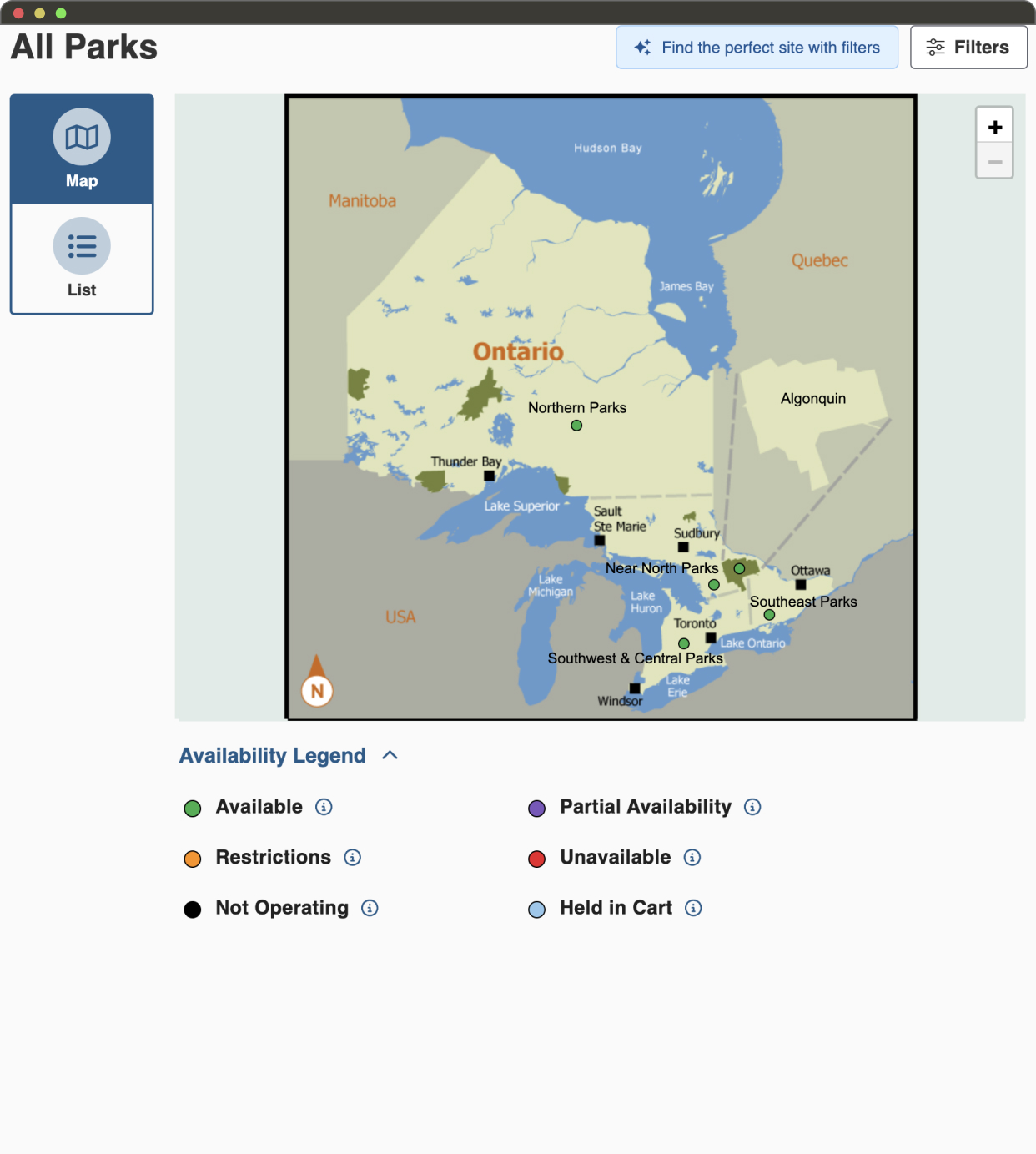
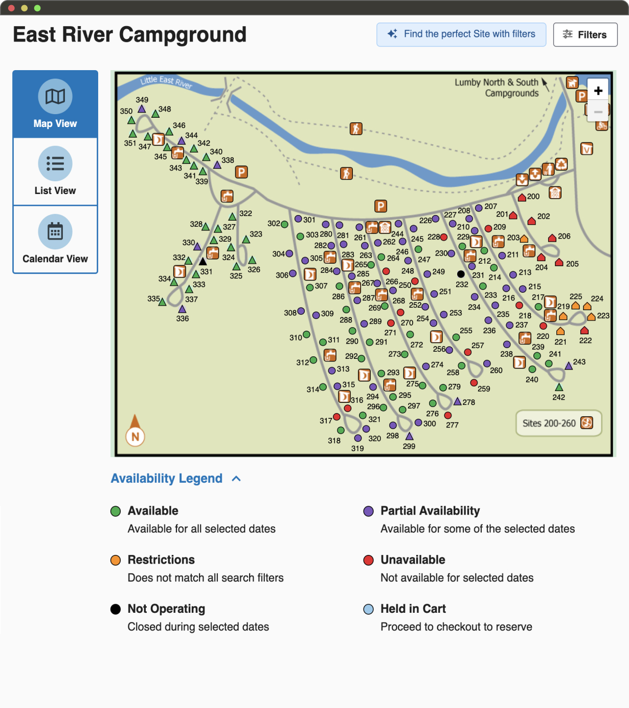
The website features, content and booking journeys did not support the user in their goal of booking a campsite.
Park information scattered across the website, a fractured user journey and booking tools hidden throughout the platform caused users to have to piece together disjointed components of the website in order to navigate the site and complete tasks.
This resulted in users having to consult external websites outside of Ontario Parks Reservations to find help when completing their reservations or in them abandoning their end goal of booking a campsite entirely.

Our Approach
After completing the research phase, our team determined that fixing the main navigational structure of the website was critical to improving all areas of the website.
The next step would be a reconstruction of the main user journey of reserving a campsite which would centralize and standardize features, content and UI elements. This would bring consistency to the user’s experience of the website considering that it is the website’s primary functionality.
User Persona
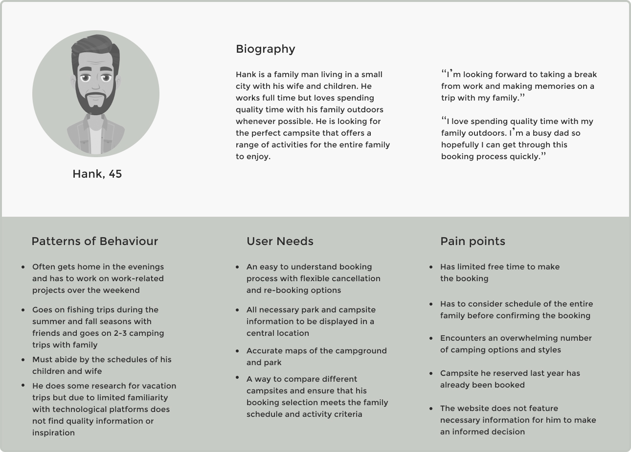
We centered our re-design around 'Family Campers'. They were the largest user demographic and the goals of the other two personas would carry over. This decision ensured that the re-design would benefit the greatest number of users.
IDEATE
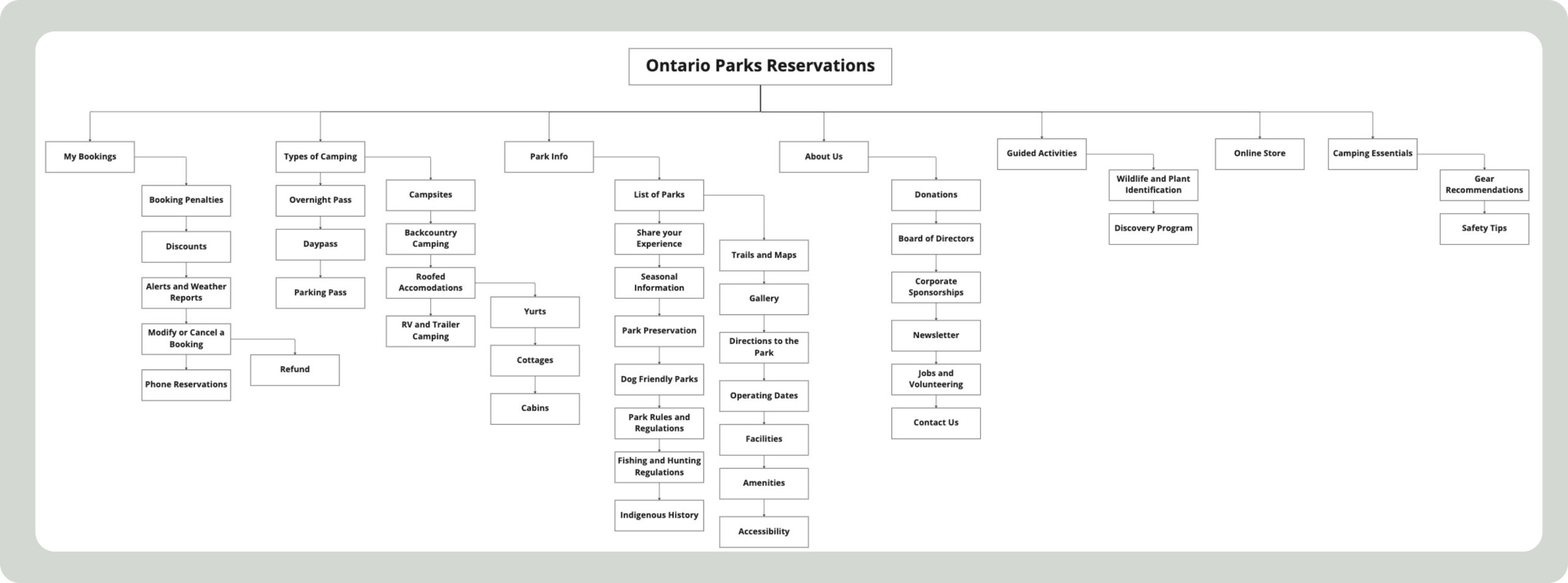
IA Diagram
A tertiary navigation system based on the results of our card sorting sessions was created in order to match the behavioural patterns of the user base to the website structure.
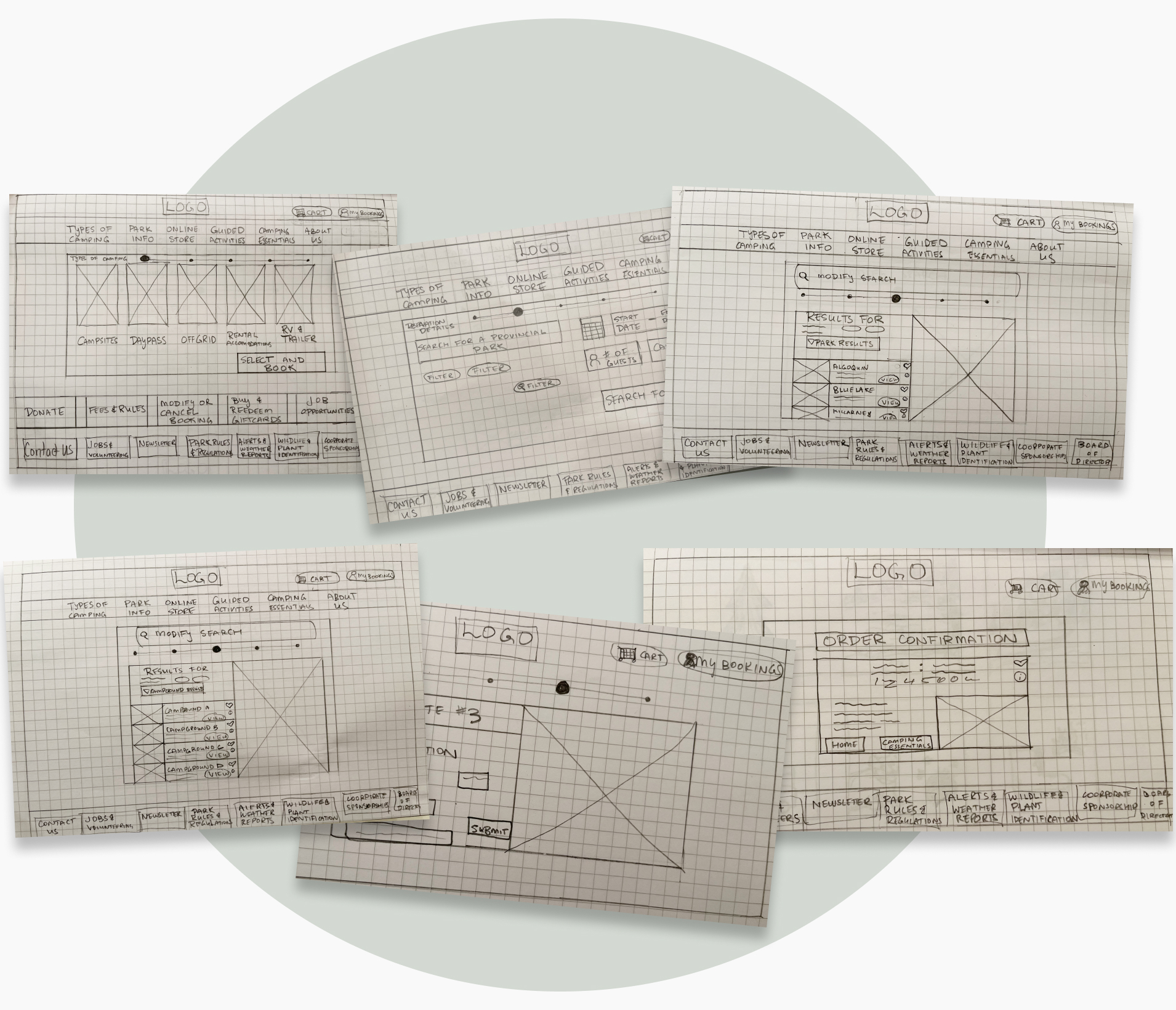
Sketching Mockup
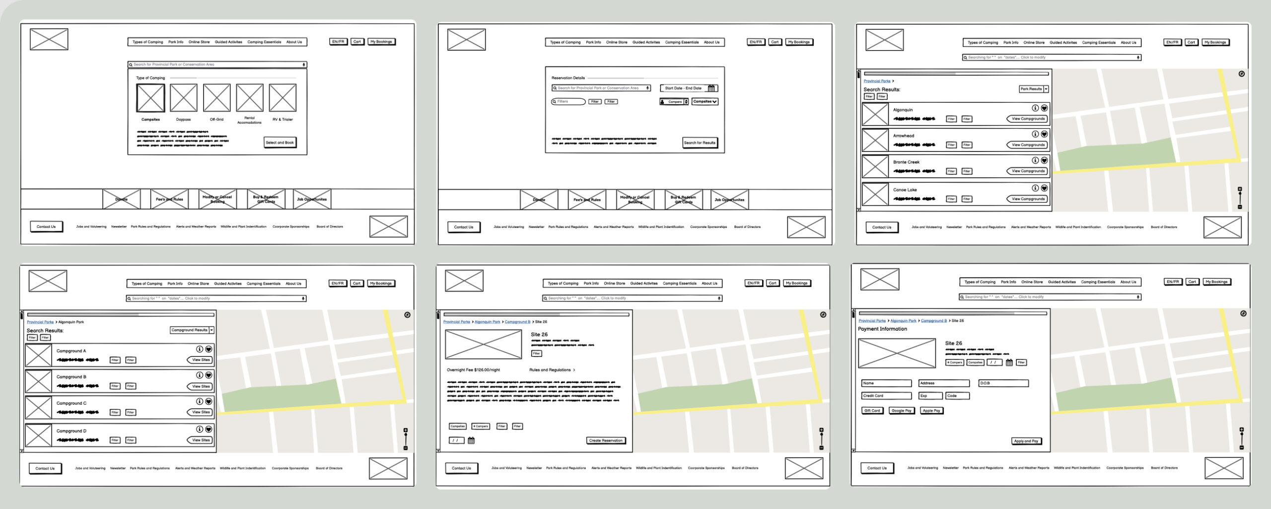
User Flow / Low-Fidelity Wireframes
Our team voted on new features and solutions for the booking journey. Layouts and UI concepts were drafted in low-fidelity wireframes on Balsamiq before entering into the usability testing phase.
PROTOTYPE -> TEST -> PROTOTYPE

Mid-fidelity Usability Testing
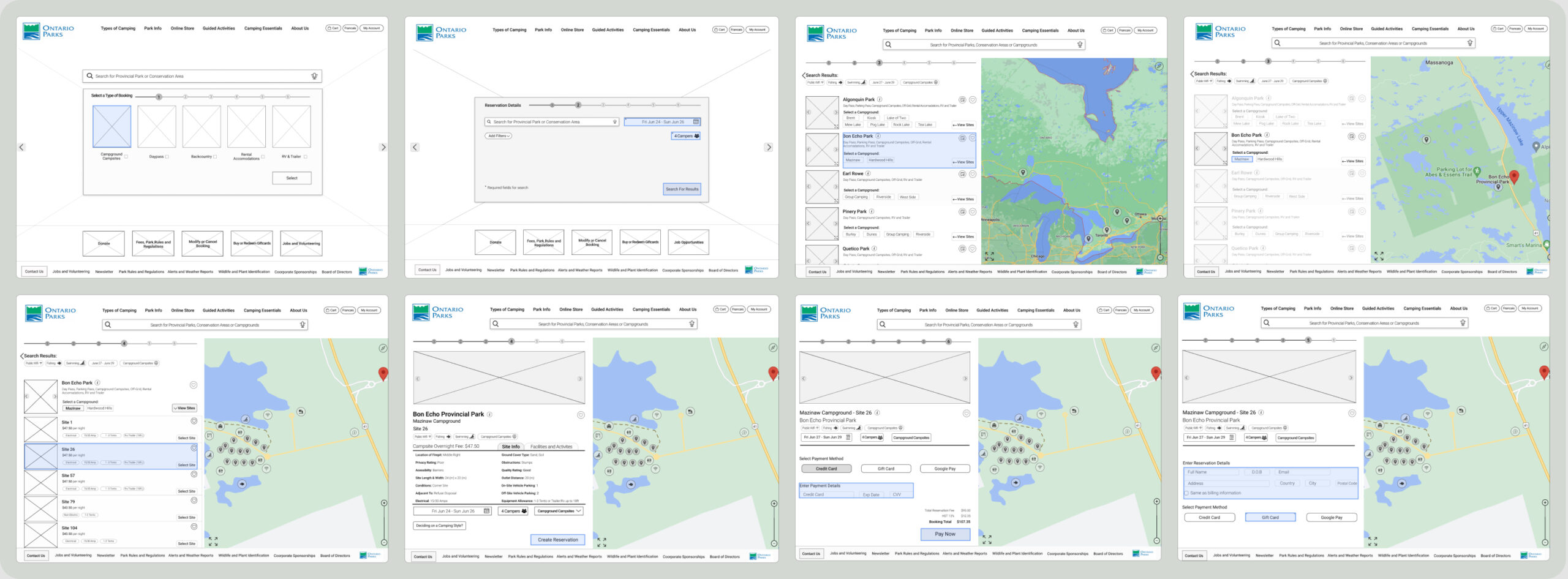
Usability Test Results
100% Success Rate Booking a Campsite
26 New Design Features Validated
12 Feature Modifications Identified
FINAL DESIGN SOLUTIONS
Introducing Booking Types
Usability testing the original website confirmed that users were unaware that the first step of the reservation process was to select a booking type using a tab layout.
To ensure that users immediately identify the first step of the main user journey, instructions, icons and a clear description of the booking types were created for the home page and are displayed during a hover state.
Adding Filters
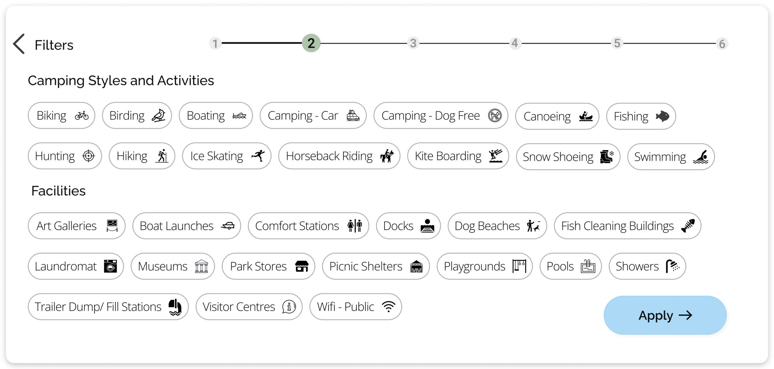
During usability testing, participants sought information about activities and facilities offered at each park.
Whereas users previously had to leave the main user journey in order to search for park details, integrating filters into the booking journey ensures that only relevant parks will be displayed to them, that their trip criteria will be met and that they will have access to all necessary information.
Dual View
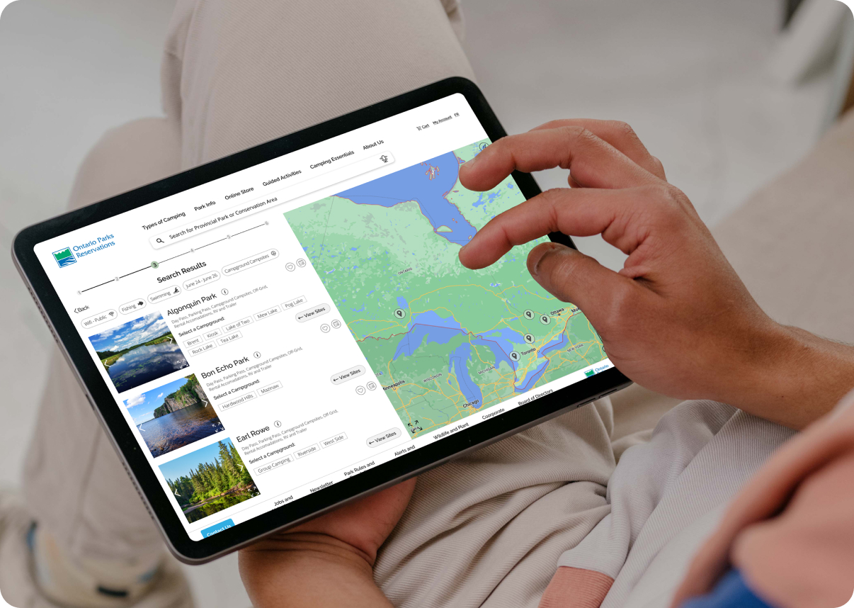
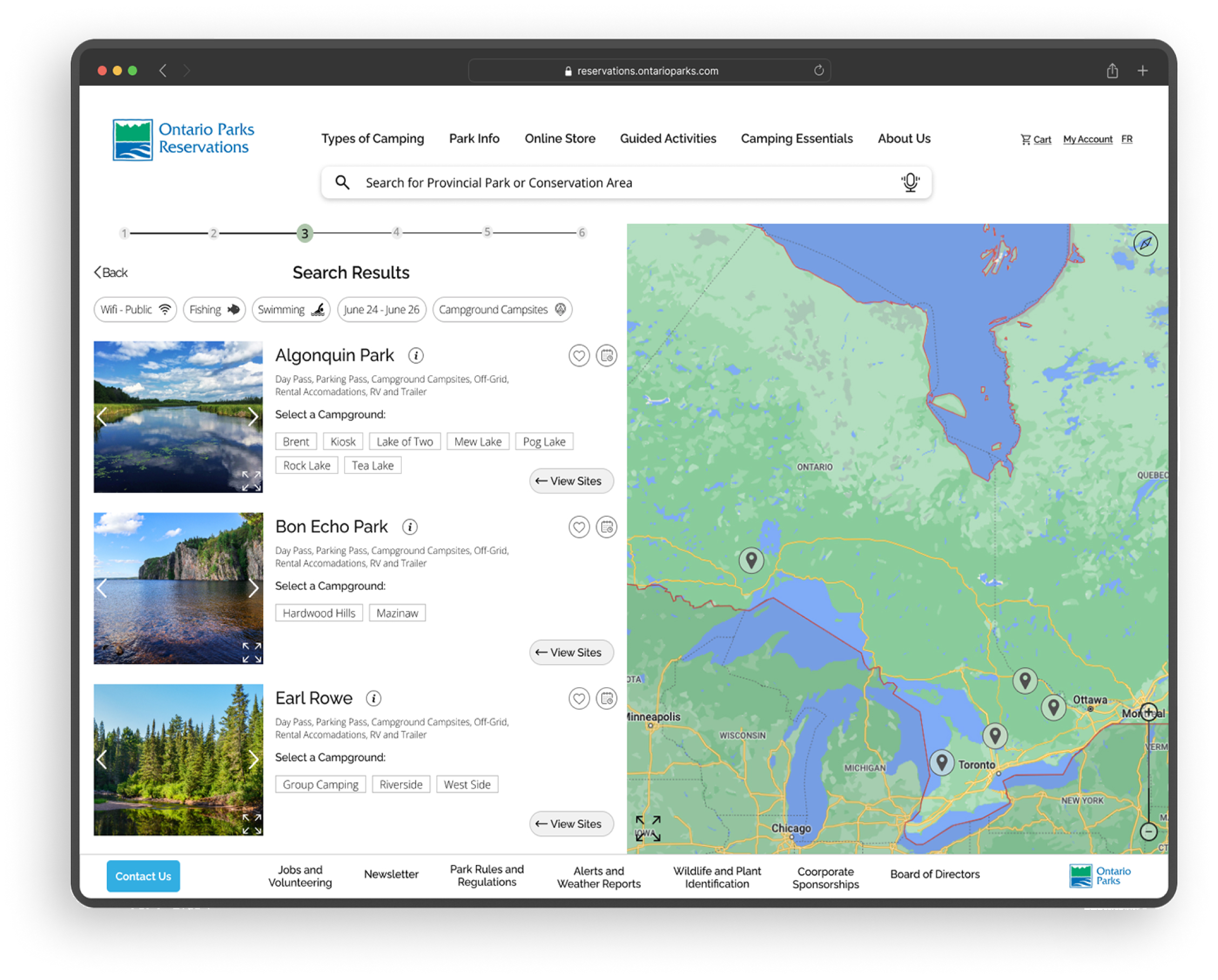
By combining the list results of relevant parks with an interactive map in a hybrid view, users can access information required for their trip from a central location. This includes park, campground and campsite details that can be found by using either park selections on the list view or by selecting the pin icons on the map view.
What I learned...
- It’s okay to have broad research objectives in usability testing. Having too narrow a scope focusing on specific elements might overlook important, unexpected findings
- Test design solutions with users early in the project to save time and reduce risk. Exploring design solutions during later prototyping stages, such as mid-fidelity, requires more time allotted to detailed modifications using software
- Heuristic analyses can act as the foundation for a project and provide structure and guidance when uncovering insights, implementing recommendations into a re-design and supporting design decisions
- Ensure a comprehensive UI guide is established before mid-fidelity prototyping to encourage consistency in visual design elements. By doing this, I have more options to choose from when drafting, and even finalizing, the UI design.
Thank you for your time!