The Archives of Ontario
Archives Information and Management System (AIMS)
A UX research study exposing usability challenges in the province's newly integrated records database. Conducted for Ontario Digital Service.
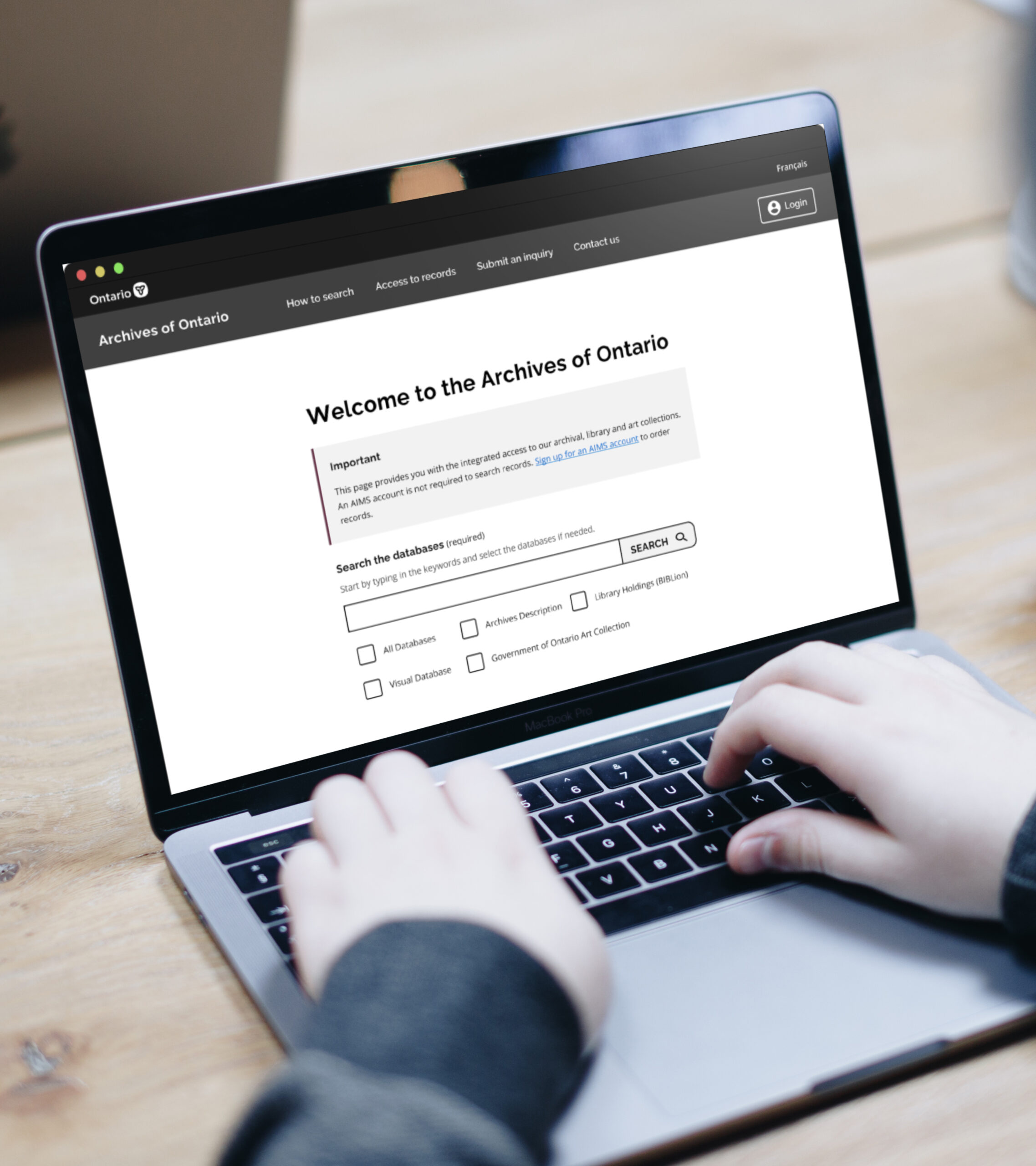
Client
Archives of Ontario
Timeline
January 2023 -
May 2023
Team
1x Senior Manager
2x Experience Designers
2x UX Researchers
2x Provincial Archivists
Role
Experience Designer
(Co-lead)
My Contribution
User Research,
Usability Testing,
Design Recommendations,
Participant Recruitment and Management
Tools
Miro
Figma
Alchemer
Excel
Project Background
The Government of Ontario received several complaints from the public who did not understand how to use the newly integrated records database, AIMS. The system, which launched in 2022, combined 4 formerly separate archival databases into 1 to expedite the search process for users. However, users were unable to find desired records, stating they did not understand the new categorization system, and were bypassing the database entirely by phoning into the archives and requesting help from on-site staff. Ultimately, the system increased the time it took to complete a search and additionally put strain on human resources.
Problem Statement
How might we help users independently locate the correct archival records on AIMS?
Solutions Summary
1. Simplify the user journey
Create a clear user journey by inserting help text/instructions at crucial decision points. Remove the secondary navigation bar which confuses users and throws them off track.
2. Improve the search results hierarchy
Indicate how search results are related to the user's initial search by highlighting keywords and organizing the results in order of relevance.
3. Re-organize content and page layouts
Divide information into sections to help users quickly scan documents and reduce the user's cognitive load.
4. Repair technical issues and time-outs
Prominent IT issues throughout the website disrupt the user journey and lead to users abandoning the use of AIMS.
Research Process
1. Defining the problem and project goals
Kickoff Workshop
+ got to know the client team and their roles
+ set benchmarks for the project outcome
+ informed the client of the design thinking process
+ created shared document space for collaboration
+ established client and Ontario Digital Service goals
+ created a rough timeline for each phase of the project

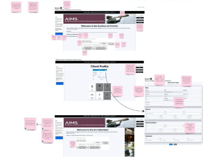
Heuristic Analysis
+ analyzed the main user flows for later usability testing
+ took screenshots of the database for documentation
+ recorded and classified design flaws violating heuristic principles
+ created questions about the platform to ask client product experts
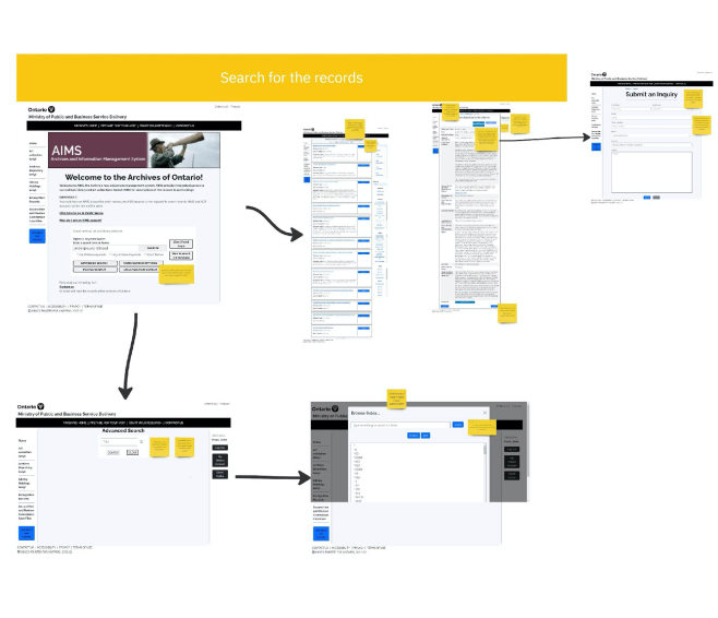
Product Walkthrough
+ heard the staff’s perspective on how users perceive the platform and collected details about obstacles the public most commonly experiences
+ learned of user pain points for internal, customer-facing employees
+ heard firsthand accounts of how staff resolves issues and their current workarounds
+ learned the differences between the public vs. the internal staff user flow
+ requested their involvement in the project to build an ongoing relationship and encourage stakeholder investment in the research
Reframing the Problem
How did we ultimately define the problem from a UX perspective?
The search engine’s unclear information architecture, lack of instructions on how to use the platform, combined with its inability to provide accurate results and broken features left users unable to operate the website independently and refusing to learn how to use the system.
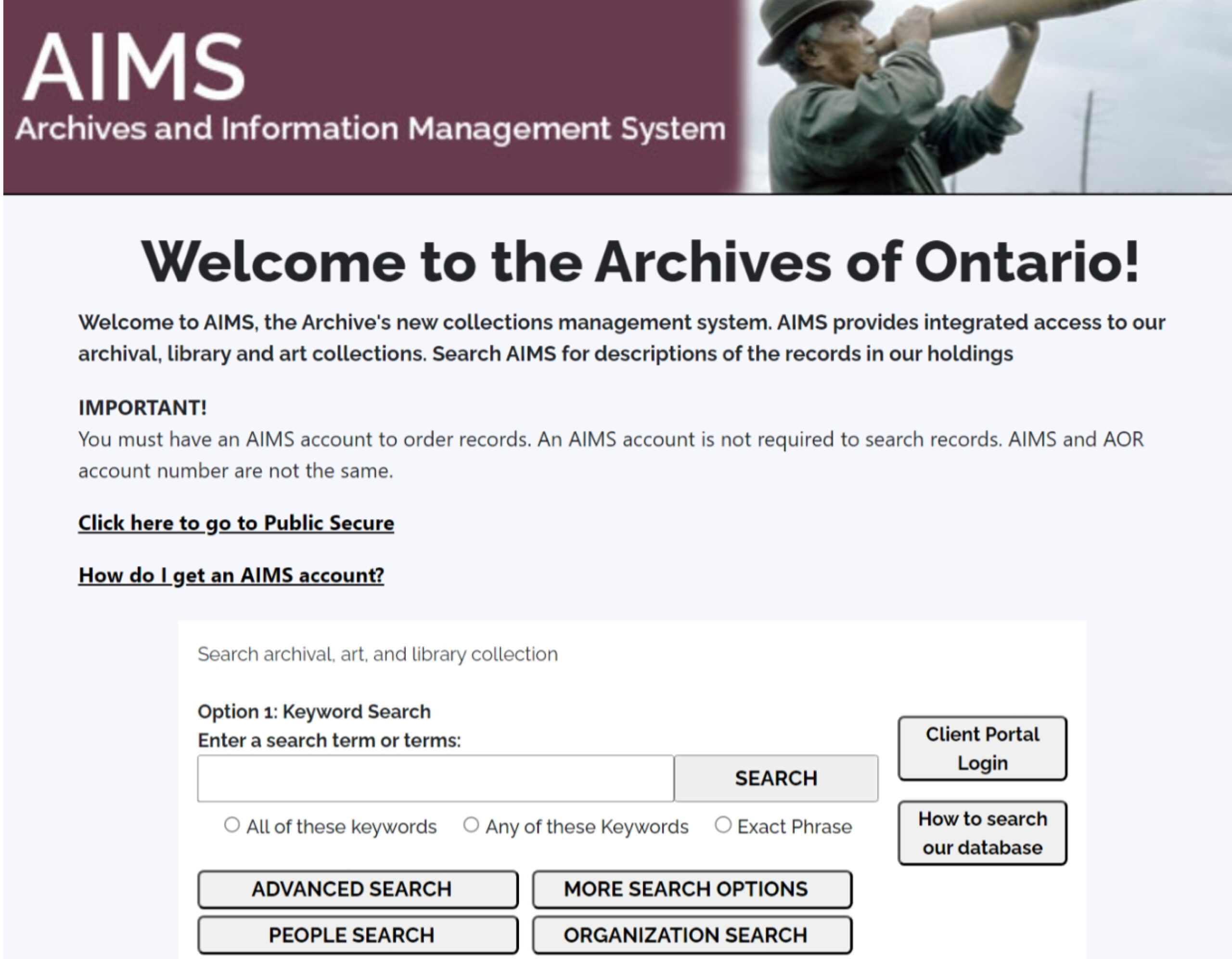
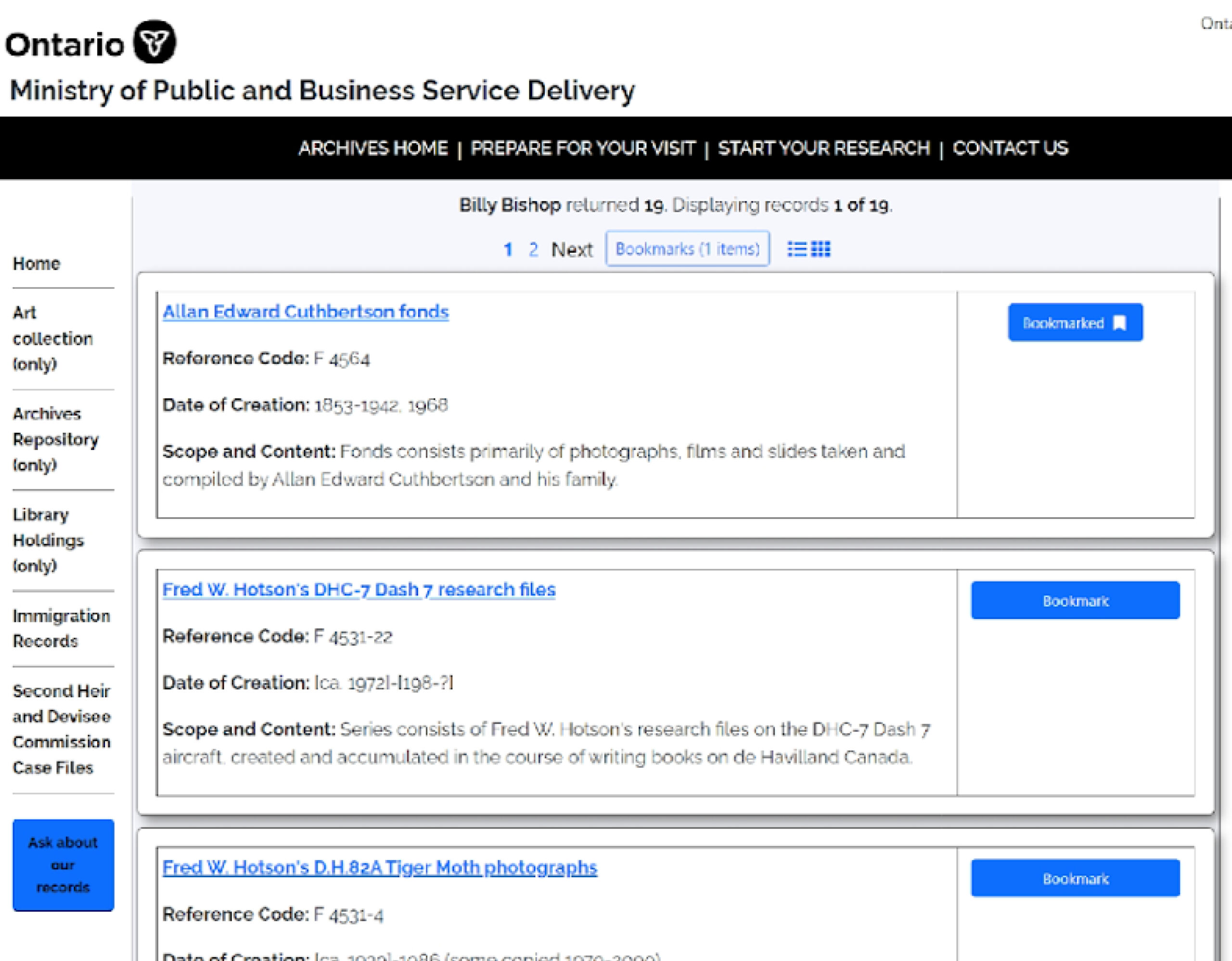
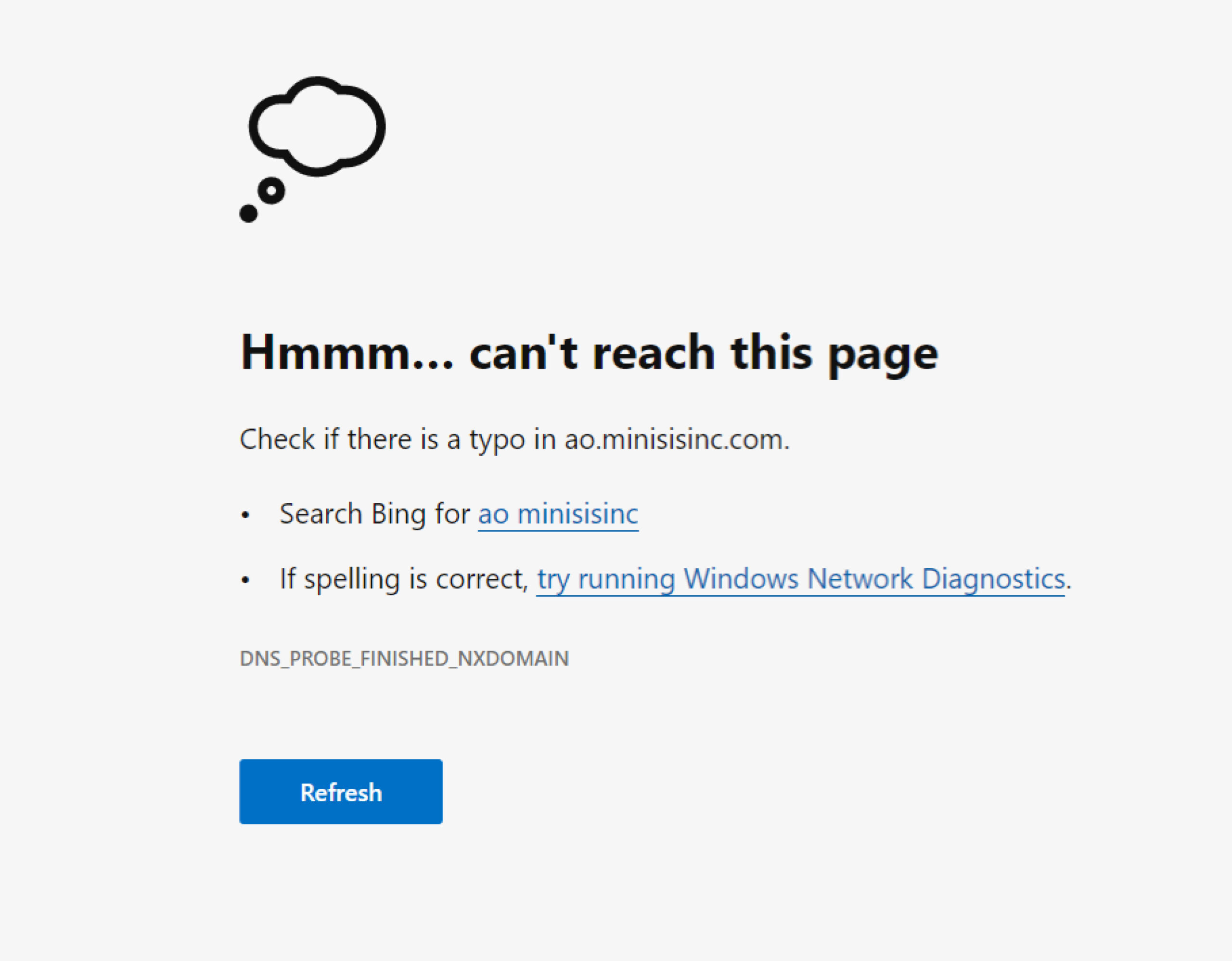
The AIMS home page, a search results page and a broken records page on the MVP.
2. User interviews and usability testing
We categorized usability issues and research objectives into four groups:
Usability and User Interface
Can users successfully search and locate desired archival documents without assistance?
What is the level of learnability of the portal?
What steps do users take to accomplish their tasks?
What do users expect at each step of the search process?
To what degree are users successful in accomplishing their tasks/goals?
How many errors do users make throughout their journey? Do they recover from these errors?
What steps do users take if they encounter a problem? Are these steps the 'expected' path?
Can users identify where to access research guides, customer service assistance and help resources?
Content Design
Is the language used on the portal understandable to users?
Do users have everything needed to accomplish their task at each stage of the user journey?
Is the layout of the website familiar to them?
Accessibility
Do the features and layout of the platform meet digital accessibility standards?
User Needs and Motivations
Do users find the experience of navigating the AIMS portal clear, enjoyable and engaging?
What are the specific contexts around why they would be using the AIMS portal?
Staff User Interviews
Discoveries
+ Specialist jargon used as descriptors is not relevant to the general public and confuses them
+ Major technical issues (IT) including broken links, system timeouts and missing search results are hidden throughout
+ New features are not suitable for quality digital showcasing of the variety of holdings available (maps, photographs, handwritten letters etc.)
+ Staff has to find shortcuts to work around improperly cataloged or seemingly ‘missing’ documents
+ The website is non-standardized with the Province of Ontario digital products or style guide
+ There are prominent accessibility issues
+ Staff stated that new features did not compare to those offered on the previous database
Usability Testing
14 Participants
8 User Backgrounds
2 Test Scenarios + 5 Tasks
Discoveries
Study Results: Key Global Findings
Usability and User Interface
Search functionality does not match the users' mental model (e.g. Google)
Help text and call-to-actions are not prominent enough to help users navigate through the process
Layouts of the results page and the detailed record page are not well-organized
Content Design
Button names are not actionable
Content is not informative and contains too much industry jargon
Not enough instructions and help text.
Some content does not stand out, can be easily missed and misinterpreted by users.
Search results do not show the hierarchy and type of the records which causes confusion (fonds, series, etc.)
Accesibility
There is no clear hierarchical distinction between the two navigation bars which causes users to accidentally go to external sites
Some buttons are not working as intended and do not take users to the right page
User Needs and Motivations
Technical glitches occur when users press "search“
The system time-out is so frequent that it interrupts the user flow
“Ask about our records” button has low color contrast and is not easy to find on the page
Research guides and relevant help resources are missing in AIMS and links within the research guides are outdated
3. Recommendations
11 Key Findings Critical to Product Function Identified
43 Actionable Recommendations Created
80+ Pain Points Found
4. Stakeholder Presentation

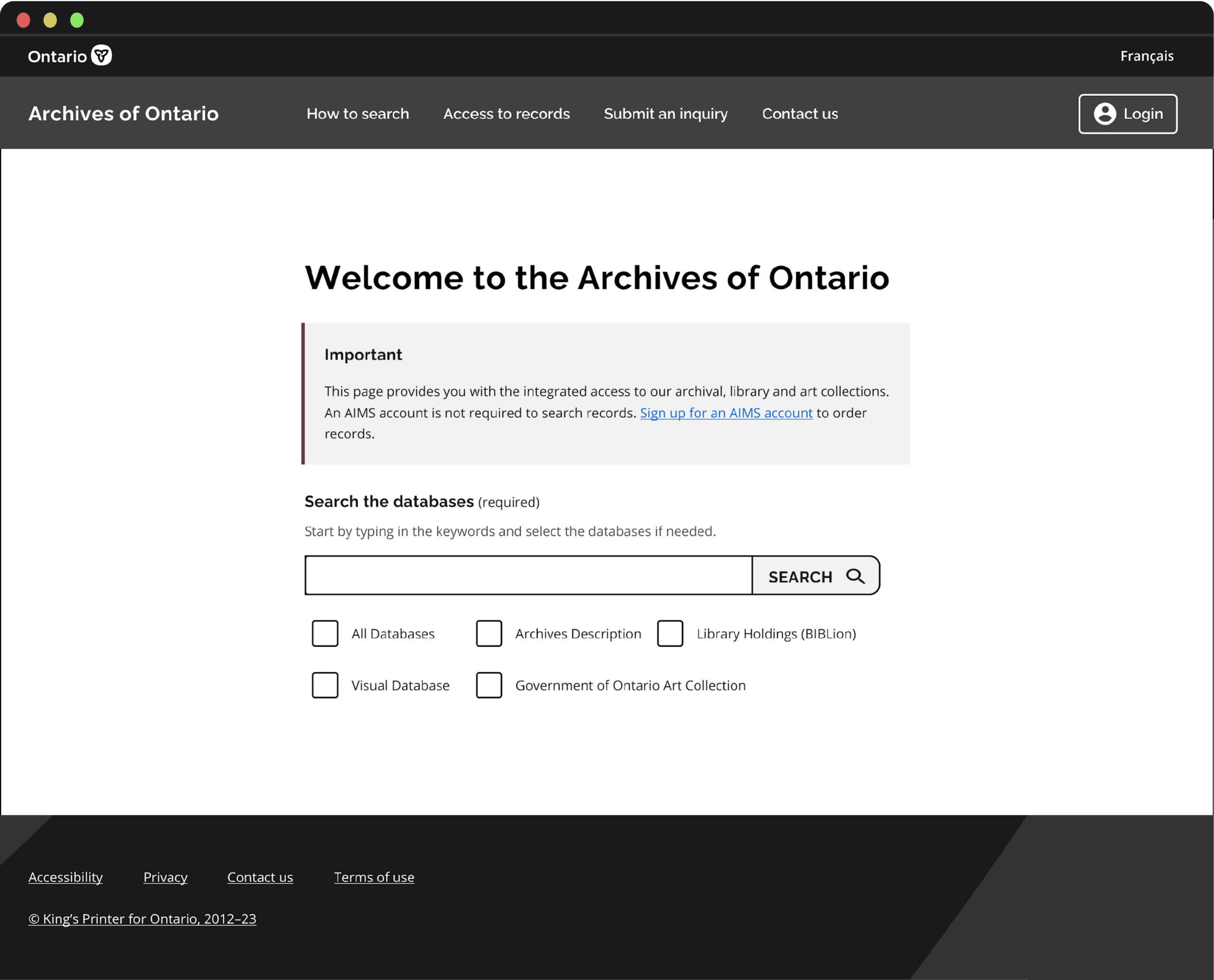
The Homepage
Eliminating the secondary navigation bar would clarify the user journey. The mockup removed unintuitive search functions, introduced clear instructions on how to use the database and standardized the UI to match the Ontario digital service style guide.

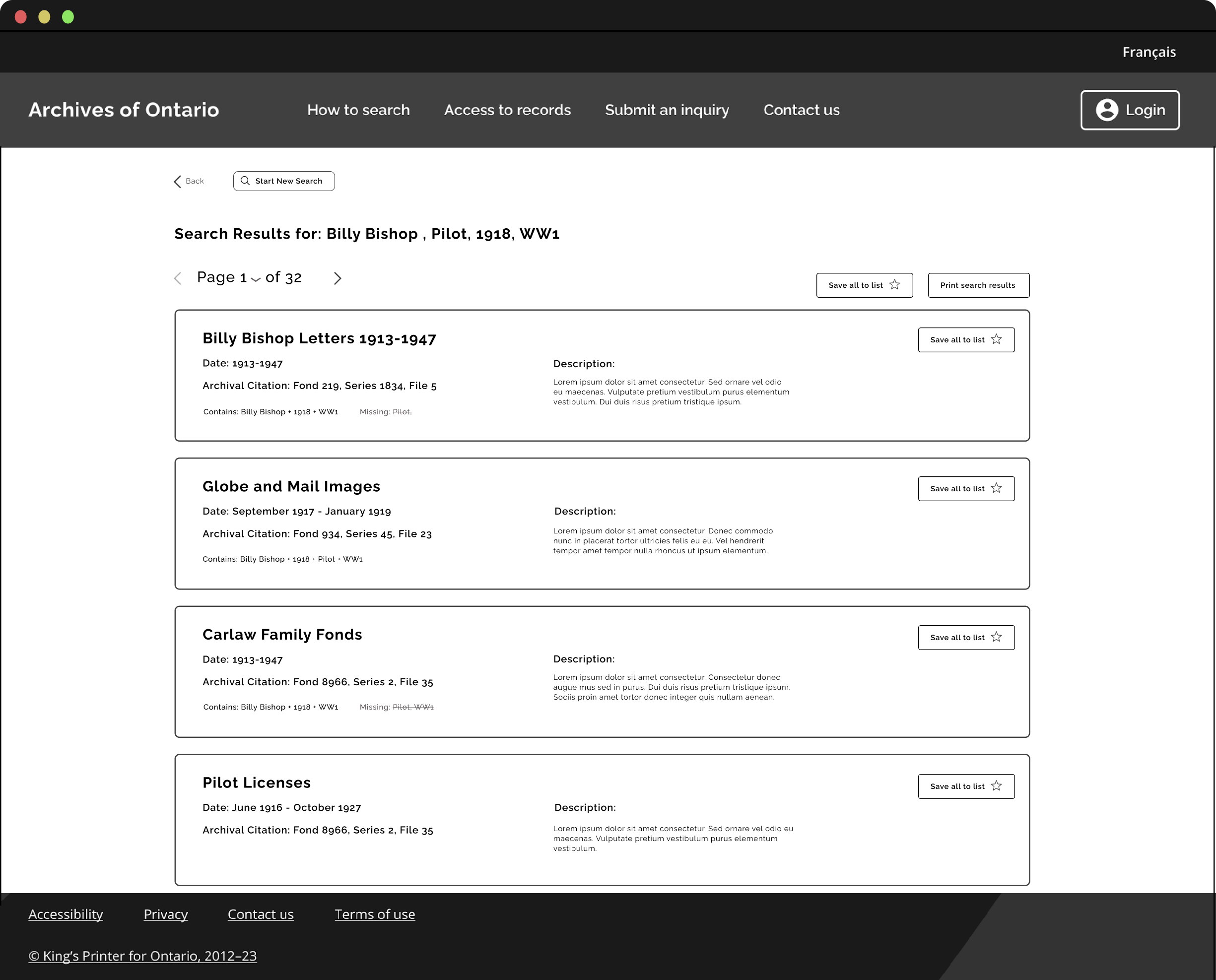
Search Results
The search results page should demonstrate the relevance of each document to the keyword search by displaying in sequential order by listing most relevant first and least related at the end. Keywords appearing in each record or missing should be listed on each result to inform the user of relevance.
Document Page
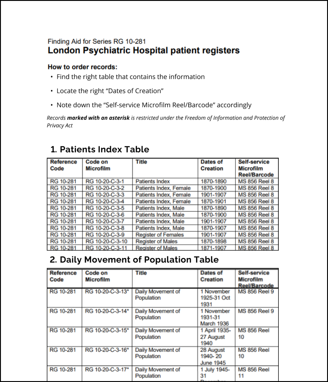
Dividing information into sections will help users quickly scan and process information to find desired information.
Study Constraints
Our study mainly focused on relatively new users and users with limited knowledge of AIMS and archival databases
Due to time constraints, we were only able to test the integrated search database whereas the website provides the option to use the former 4 databases as separate entities. These must still be tested.
Only 2 main user flows were tested on the primary database due to time limitations and scale of the database
Future Roadmap
Further usability testing of the database with more experienced users will take place in collaboration with the Ontario Digital Service agency once approved by the client. Next steps will include testing user journeys and user goals not covered during this study.
Prototypes will be developed and tested before officially integrating design recommendations into the database. This will be followed by another round of usability testing to ensure that the revised database meets user expectations.
Key Takeaways
Involve the stakeholders in the evolution of the project and establish connections with as many people on the client team as possible. Not only will this encourage their investment in the project outcome, I might also learn important product details and history along the way that I wouldn’t have otherwise.
Identify the right stakeholders before doing the kick-off workshop - There may be more than initially thought.
Don’t be afraid to ask for extra support or resources if need be.
Providing mockups is extremely effective for helping the client visualize solutions and encourages client engagement.
Thank you for your time!